Pre-Sale Landing Pages for Solo SaaS Ideas
Validate solo SaaS demand before you code by running a structured four-week sprint.

A pre-sale page is a demand test for validating a product before it's built. That shift in thinking matters because the old bottleneck, the one that justified treating a landing page as an afterthought, has disappeared. AI coding assistants and no-code platforms now let a single person with no developer background ship a working SaaS product in a weekend. The 2026 landscape for solo founders is this: building is solved, and distribution and operations are the new hard parts. When shipping a product takes a weekend instead of a quarter, shipping stops being the thing that separates winners from everyone else. Failory's research found that 34% of startups fail from a lack of product-market fit, and that number points to where the real risk has always lived: not in whether the thing can be built, but in whether anyone will pay for it once it exists. The pre-sale page is how a solo founder answers that question before sinking a single weekend, let alone a quarter, into code.
What a Pre-Sale Page Tests
A pre-sale page tests willingness to pay. It does not test interest, curiosity, or enthusiasm, and treating those as substitutes produces false confidence at the exact moment a founder most needs an honest signal. Customer interviews and waitlists leave room for what Failory's pre-selling guide calls the niceness gap: the distance between the number of people who tell a founder their idea is good and the number who will actually hand over money for it. People avoid deflating someone's enthusiasm, so they overstate how much they like an idea and how likely they are to use it. A tweet with fifty likes says nothing reliable about demand. A pre-sale page with a working Stripe checkout does, because money in the bank cannot be explained away by politeness.
A fair objection follows: a page that converts cold traffic into a cheap lifetime-deal commitment mostly tests copywriting and price sensitivity, and the product that eventually ships may look nothing like what the buyer pictured when they paid. That objection has real teeth, and the answer is not to drop the pre-sale page. Pairing it with direct conversation rather than letting it stand alone is the answer. The VenturOS guide for solo founders puts both moves in the same week of the validation process: pre-orders collected through Stripe, run alongside a set of interviews with the specific person the founder believes they're building for. Payment validates that someone will pay. Conversation validates that the founder understands the actual problem being solved. A founder needs both signals before committing to build anything, because email signups, waitlist entries, social follows, survey responses, and compliments offered in an interview are all soft signals that don't hold up under pressure on their own. The practitioner standard treats a meaningful email capture rate from cold traffic as the floor, with at least some portion of that list converting to real payment before any build decision gets made.
The four-week validation sprint the page sits inside
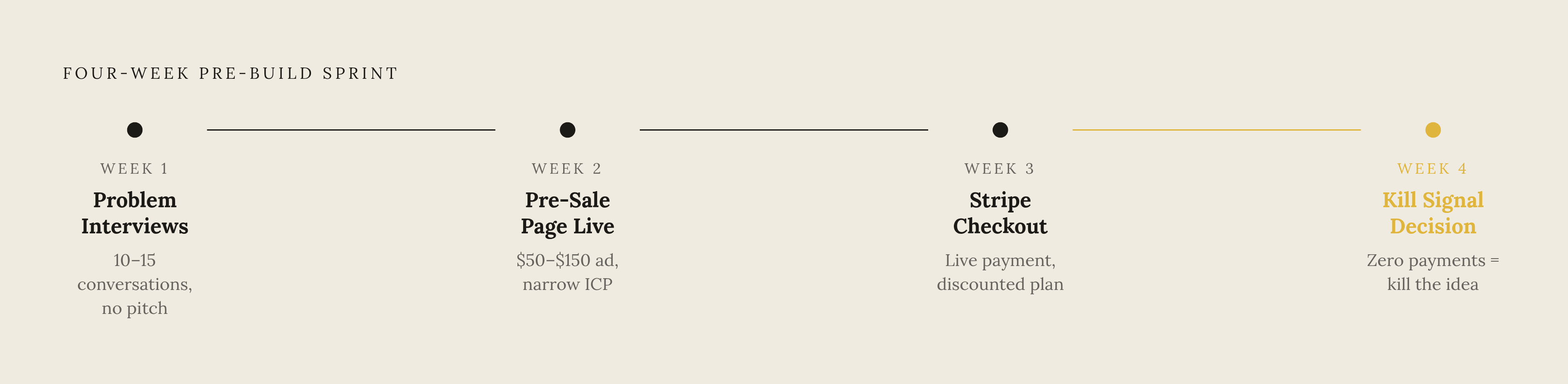
The pre-sale page only produces a trustworthy signal when it shows up at the right point in a sequence. Used in isolation, or too early, it tests nothing reliably, because the page needs cold traffic and a sharpened problem statement behind it before its numbers mean anything. The sequence runs across four weeks. Week one is for problem interviews, somewhere between ten and fifteen of them, and the discipline here is to ask people about their last week rather than pitch them an idea. A pattern of pain either appears across those conversations or it doesn't, and that pattern is what the landing page will later need to speak to. Week two is when the page goes live, because by this point there's a real problem statement worth testing against cold traffic. The standard move for buying that traffic is a $50 to $150 ad campaign on Reddit or LinkedIn, aimed at a narrow, specific ideal customer profile. The VenturOS guide is direct about what this spend is for: a founder is buying signal, not customers. Week three introduces real pricing: a live Stripe checkout for a discounted lifetime or annual plan, in place of a form promising access at some future date. Week four is the decision point. Zero payments after a real volume of traffic is a kill signal, and the correct response to that signal is to kill the idea, not to keep rewriting the headline in hopes the next version converts.
Two documented cases show both ends of this sprint working as intended. Jon Yongfook bootstrapped Bannerbear from zero by building and shipping the product first, then growing revenue step by step from there. Brian Casel took a different route with Ops Calendar: a screencast walkthrough built from animated Keynote mockups, with no working product behind it, brought in $3,000 in pre-sales inside six weeks, Failory reports. Rob Hallam's path to SuperX shows the cost of skipping this structure. Two and a half years and five failed products came before SuperX found traction, and the solo founder guide cites that trajectory as the price of building on intuition instead of running a structured validation sprint first.
The hero section: one outcome, not a feature list
The hero section is the highest-leverage piece of real estate on the entire page, and it's also where most founders make their first mistake. Analysis of SaaS landing pages names a hero section that describes the product instead of showing what changes for the user as one of three core reasons most of these pages fail to convert. A visitor does not want to know what the product is. A visitor wants to know what gets better for them in the next thirty seconds of reading.
Notion's headline, "Your AI workspace with built-in agents," commits to an outcome rather than listing a feature set, and the page answers the question "what does this do for me?" in under three seconds. That example is useful as a contrast, not a template to copy, because Notion already has a product, an install base, and years of brand trust behind that headline. A solo founder's pre-sale page carries none of that weight, which makes the headline's job harder, not easier. With no product to point to, the headline is doing the entire job of convincing a stranger that something real is going to change in their life.
The structure that holds up under that pressure is simple: one outcome stated in the headline, one sentence of specificity in the subhead, and one call to action. No second CTA competing for the click. No second value proposition dividing the visitor's attention. No second screenshot pulling focus from the first. The landing page analysis is specific about this failure mode: more than one CTA, more than one value proposition in the hero, or more than one screenshot is where conversion leaks out of the page. For a pre-sale page without a finished product to photograph, a mockup or an animated prototype does the job a screenshot would otherwise do. Failory documents a SaaS tool for web designers that made $1,225 in pre-sales, 25 copies sold, using nothing but a mockup of the idea. What matters is that the visual signals something real is actually being built, even when nothing is live yet.
A fast way to check a hero headline before publishing it: read it out loud. If the sentence could just as easily describe three other products in the same category, it isn't specific enough yet, and it needs to be rewritten until it couldn't describe anything else.
Social proof before the product exists
The most common objection a founder raises after fixing the hero section is some version of: there are no users yet, so what goes where the testimonials are supposed to go? That's a real constraint, but it's a solvable design problem, not a reason to leave the section blank or fake it.
Quotes pulled directly from the problem interviews in week one count as real social proof. A line like "I spend three hours a week on this manually," attributed honestly to a real conversation, carries more weight than a generic testimonial because it's specific and verifiable. Endorsements from people the target customer would recognize count too, even if those people haven't used the product, because their name lends credibility to the problem being solved. Mentions from Product Hunt, a relevant subreddit, or a newsletter the ICP already reads work the same way. Founder credibility is its own form of proof: prior work, domain expertise, or an existing audience all signal that someone capable is behind the idea. AJ, the founder of Carrd, had already built a following around his HTML5 templates through HTML5 UP and Pixelarity before Carrd existed, and that following functioned as a trust signal well before a single Carrd site had been built. Once the pre-sale page starts collecting actual payments, the running count becomes its own proof: a line reading "47 founders have already pre-ordered" is honest social proof that didn't exist a week earlier. Failory's guide also points to offering a call with the founder, or closer involvement in shaping the product, as a pre-sale bonus, and that offer works double duty as a trust signal, since it tells a visitor someone accountable and reachable is standing behind the page.
What damages credibility faster than an honest absence of proof is a fabricated one. A vague testimonial with no name attached, a logo from a company with no real relationship to the product, or a blanket claim like "trusted by thousands" before a single user exists will cost more trust than simply leaving the section empty.
Setting the price on a pre-sale page
The price on a pre-sale page is a deliberate instrument for sharpening the signal the page is built to collect, and the choice of price shapes who converts and what that conversion actually reveals.
Two pricing structures dominate at the pre-sale stage, and each one tests something different. A discounted lifetime deal tests absolute willingness to pay and tends to attract early adopters who want in before pricing settles into its final form. Failory reports that Danny Postma's Headlime sold a large number of lifetime deals within a couple of days at a tiered price, generating meaningful presale revenue. A discounted annual or monthly plan tests something closer to the model the product will actually run on once it ships: recurring commitment rather than a one-time purchase. Failory reports that Simple.ink pre-sold over $1,000 in discounted yearly plans before launch by leveraging the founder's existing site audience. Neither structure is the correct one in some universal sense. The right choice depends on which signal the founder actually needs at that stage, and both are legitimate experiments to run.
The discount is the mechanism that overcomes the single biggest objection a visitor has: paying today for something that doesn't exist yet. Without a clear reason to act now instead of waiting for launch, most visitors will simply wait, and the page will collect traffic without collecting signal. Price also filters who shows up. A low-cost lifetime deal pulls in a different kind of buyer than a higher-priced annual plan, and that filtering effect is itself useful information about who the eventual customer base looks like.
Three mistakes erase the signal a pricing page is built to produce. Hiding the price behind a "contact us" form removes the test. Posting "pricing coming soon" does the same thing with extra steps. Offering a free waitlist as the main call to action swaps a real payment signal for a soft one, undoing the whole point of running a pre-sale. The same discipline that governs the hero section applies here: one price, one call to action. Multiple pricing tiers introduce decision paralysis at the exact moment a visitor is deciding whether to trust the page at all, and that's the wrong moment to ask someone to compare three plans against each other.
The CTA: what you are asking people to do
The call to action is where the entire page either produces a real answer or quietly fails to. Every design choice before this point, the headline, the mockup, the social proof, the price, exists to get a visitor to this one moment, and the strength of the ask here determines how much the resulting data can be trusted.
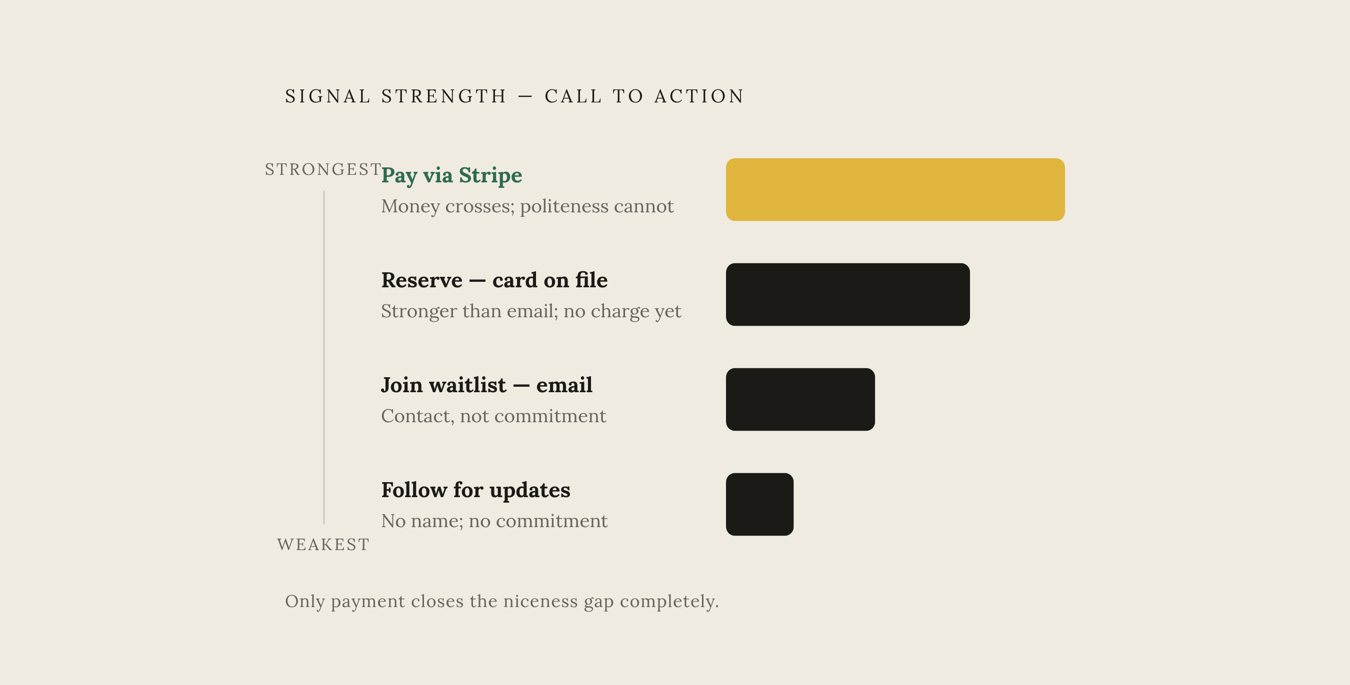
CTAs fall along a clear hierarchy of signal strength. Paying now through a Stripe checkout is the strongest version, and it's the only one that closes the niceness gap completely, because a stranger does not hand over real money out of politeness. Reserving a spot with a card on file is a step down from that, stronger than collecting an email but still short of an actual charge. Joining a waitlist with an email address gives a founder a name and a contact, not a commitment. Following for updates gives a founder neither. The VenturOS guide is direct about the goal of the whole exercise: buying signal, not customers, and that signal only means something when the ask behind the CTA button carries real weight. A founder who settles for the weakest version of this hierarchy, an email capture dressed up as validation, walks away from the sprint with a list of names and no real answer to the only question that mattered going in: will anyone actually pay for this.